Parsing and enriching Clockify data for fun?
I’ve been interested in my working habits for a few years now. Well, maybe more than a few. Historically, I’ve been the type of person who will work for 9 - 10 hours a day. This was likely ingrained from an early age since my dad routinely works that (if not longer) and has been for 40 years. In late 2021 a colleague clued me into Clockify: a work time tracking tool. It’s mostly geared towards people who need to bill clients per hour, but it functions well enough to track and store usual working hours. Unfortunately, all the juicy stuff is pay-walled away, but that wouldn’t be enough for me anyway.
As such, ‘Locke’s Stupid Clockify Analyser’(LSCA) was born. My initial goal was simple: get all my Clockify data and plot it against various things. Getting to that point was easily achievable via a spreadsheet, so it needed more. I have no idea where the following came from, but at some point I thought correlating my working time with various weather would be interesting.
After probably around 10 - 12 hours of coding I came to a natural conclusion point with this project, so now I’ll explain it a bit in depth then go through the results.
LSCA
LSCA can be split into two parts: data wrangler and plotter. The data wrangler does the following:
- Imports a Clockify CSV export
- Flattens the entries into single days
- Gets weather information for that day at my lat/lon
- Store it in an SQlite DB
Pretty simple. The weather data is all from <open-meteo.com> which fucking rocks.
The plotter is where most of the coding time went. I’ll explain shortly, but this basically does what it sounds like:
- Run some SQL query
- Do some data post-processing
- Draw some plots
And if you thought I did this in some sensible language for doing this type of stuff, you’d be wrong since I used Go. Why? I wanted to do something small (and finish it) in Go because I’ve been using it more and more at work (and this project actually really helped with that).
Components
- For the queries I used
go-resty, which I’m very familiar with. However, I tried usingv3but it refused to behave, so I went back to the comfortablev2 - For the CSV parsing I used
gocsvbecause I can directly unmarshal a file into an struct type with little pain. Big recommend - For the SQLite stuff I used
go-sqlite3which is fine. It requiresCGOENABLEDat compile time which I don’t particularly like, but it works and doesn’t shove any ORM in my face (which funnily enough could have been useful) - For plotting I used
gonum’splotpackage. It’s fine. Kinda. I does sort of a job sort of well, but it’s clearly not built as a totalmatplotlibreplacement
The Feature Creep
At some point, prior to writing the plotting code, I planned out a way for this tool to be bigger and better and eventually enough that it would be running on my homelab (still in progress) so I could update it at anytime. Once the plotting began, it was very clear that these new goals couldn’t be achieved. Additionally, once I started seeing some of the results, I realised that updating it all the time wasn’t particularly valuable.
And the feature creep went away. Possibly to return at a later date, but likely not.
Results
The whole purpose of this project was basically for this section, so strap in. I picked a few queries that I thought to help elucidate my working habits and maybe show them in a new light. This “few” ultimately turned out to be six, since things like max working time per year’ is boring, while queries that utilise 5+ dimensions were not suitable (again, I’ll explain later).
This data consists of 3 complete years of tracked data with 833 working days. A couple of interesting analyses had to be thrown out from the start since they were too hard to separate from noise. These are things like “how often would I return after a headache and for how long” or “how did a public holiday affect my work week”.
Firstly, lets look at the average working time per weekday.
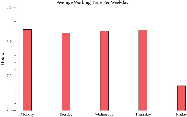
It’s not very interesting BUT it contradicts my thoughts. Monday through Thursday I basically work just over 8 hours a day. How novel. Friday’s I uhhh kick off a bit early, but not too early. I was surprised at how both how not much over 8 hours the four days are but also how practically identical they are. Internally, I feel that Monday and Thursday are my longest working days. This says otherwise, kinda.
Secondly, let’s expand this a bit and see how it looks per the three years of data I have.
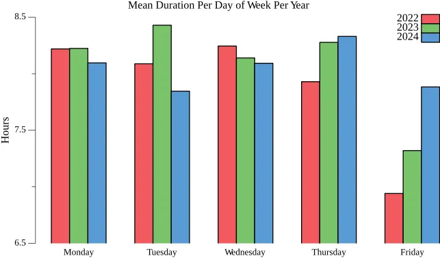
My Mondays and Wednesdays across the 3 years are basically the same. Tuesday and Thursdays differ a little more but only by a few minutes. I do not know why my Tuesdays in 2023 were so much longer but whatever. Friday’s on the other hand. In 2022, I would stop on average just under 7 hours of work (6.8). The rise by an hour in 2024 makes sense as the number of responsibilities I had increased dramatically (and there were quite a lot of 15-1600 meetings due to timezone differences).
Between these two charts, it appears that I work basically the amount of time I’m paid for (plus a little more). Huh.
Thirdly, and still thinking of working time, let’s look at how the weather affects my working time.
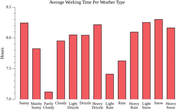
“Rain rain go away, come again another day” seems to an adage that would work here. Except for when it’s heavy. The most confusing one here is ‘partly cloudy’ but I suspect that is due to only 2.9% of entries sharing that weather code. But basically aside from those rainy days, it’s always roughly 8 hours a day. Yawn.
Ok, now lets look at some starting and finishing times. Things are a little more interesting but thanks to a couple of outliers, the results are very boring. Starting with the earliest time I started work per week day per year.
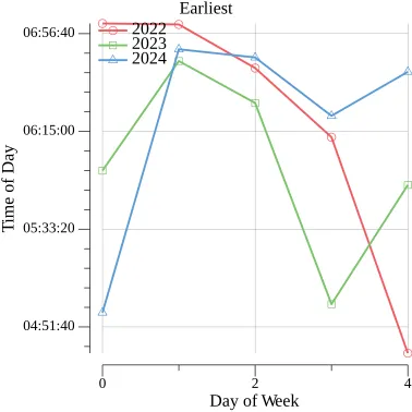
I should really take out anything before 6am as those entries are insomnia driven. But if you squint real hard you can see a trend that during the course of the week I start earlier and earlier. What about the latest time I started work per week day per year?
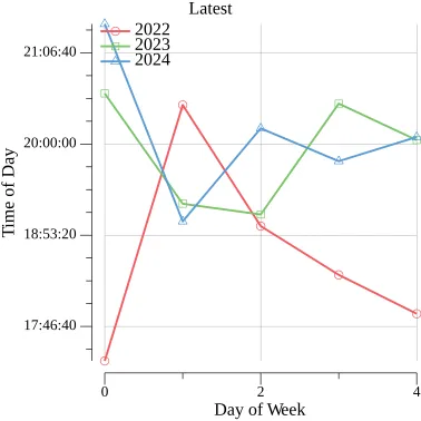
Some more outliers that could have been scrubbed (or maybe plotted in a much different way), but it’s not very informative either way. But at least there are not 2200+ ending times. I will say though in 2022 I was much stricter about my working habits. Seems like I’ve just given up since (again LOTS more responsibilities).
In hindsight, these as line graphs is just wrong and I should have used something wayy more appropriate.
Finally, we come to the noise graph that I was hoping would show something at least a bit interesting. This is working duration and daylight duration per year.
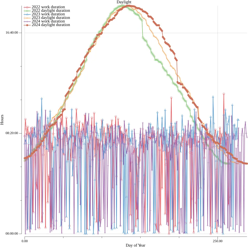
Absolutely ZERO correlation. Again, if you squint you MIGHT see a slight dip during summer (oh I wonder why) but ultimately the amount of daylight in a day doesn’t really affect my working habits.
What’s the big takeaway from all these charts? I work enough, maybe a tiny bit too much. The weather and sun doesn’t affect it, and sometimes I’ll push hard to get things done. These conclusions I basically already knew, albeit I don’t work as long as I thought I did.
Post-Mortem
The absolute main thing from this project was: use the right tool for the right job. Everything up until plotting made sense. Trying to make interesting and informative plots in Go is not easy. It might also be not possible for the data I have. But I don’t want to spend more time trying to find out. Were I to do this project again (or maybe when I revisit this in January 2026) I would do all the analysis in Python, because doing that stuff there is dead simple and the range of tools available for you is just astounding. Gonum’s plot is a great package and the work put in for it is amazing, but it’s for a very specific need that just wasn’t mine.
My coming to the conclusion of this project was basically due to the awkwardness in plotting. I did leave out one query I thought was interesting, namely “after an extended break, how long did it take to return working at full capacity” but after thinking how to do it in what I had built was just a non-starter.
What Did I Learn?
- More Golang stuff. Generics are much more painful in Go than I thought
- Structuring a Golang project
- Dealing with well documented public APIs. I don’t get to do that with work (they aren’t well documented)
- WMO codes are kinda cool but my god what a messy standard
- I’m still bad a choosing the right plot for the right data. I can partially blame gonum for that I guess but still
- USE THE RIGHT TOOL FOR THE RIGHT JOB!
If you’re interested the code is here. It’s not that great but it might be of interest.